


Mobile user interface, not in the face!
When approaching the user interface for a Genode-based phone, we started with the vague idea to mirror time-tested user-interface paradigms established in the worlds of Android and iOS, but we ultimately diverged from this beaten track. Instead, we took the opportunity to reflect the unique security architecture of our operating system at the user-interface level, giving the user an extremely strong sense of control over the device. This article presents our rationale and the initial scope of functionality.
The user interfaces of commodity smartphone operating systems like Android or iOS covers a plethora of concepts and features. Since user-installable apps routinely install background services, trigger notifications, access global data such as the address book, record positional data, or even change the appearance of the home screen, there is no line to draw between appliance-like functionality and higher level applications. Initially, when contemplating a user interface for the Genode-based smartphone, the first impulse was to mimic existing commodity user experiences to provide users with a sense of familiarity.
However, once we discovered that a clear-cut distinction between the appliance-like role of the device and the user-defined functionality is not only feasible but highly desirable, we explored a new design that reflects the distinction directly at the user-interface level. To see why that split is desirable, let us consider that both roles of the device have very different characteristics.
Appliance role
Looking at the device in its role of an appliance, the user wants to exercise control over physical aspects of the device, down to the powering of various parts. The tighter the level of control, the higher the sense of transparency, trust, and stability. An appliance should behave and present itself as completely predictable. Like knobs on a car's instrument cluster, all controls are expected to retain their position and have consistent effects. Once learned, the user never has to re-adapt. The user interface should stay out of view except when called for. It is not expected to follow any fashion trends. Instead, it should be calm, timeless, and boring. A well-engineered appliance fulfils its intended purpose without friction and complexity.
User-defined functionality
The end user wants to operate the device in a way that is not prior known. Preferences and needs may greatly vary. Expandability and flexibility are of great importance to cover a wide range of use cases. The user interface should not be constrained by concepts baked into the device. Applications may be sketchy, or come from untrusted sources. The user may still want to use those applications without trusting them. User applications are often expected to follow trends, or entertain the user in some way, or improve over time via updates. The user-defined functionality is the opposite of fixed.
When framed this way, it becomes clear that any user interface that tries to accommodate both roles at the same time must be a compromise. To avoid chasing such a compromise, we decided to give the device the two faces shown below, which can be toggled at any time via a simple touch gesture.
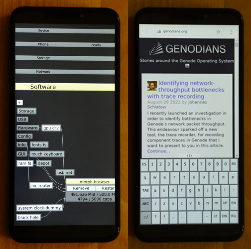
|
|
The split personality of the Genode-based PinePhone. On the left, the user can exercise the appliance role of the device. On the right, user-defined functionality gives complete freedom over the user experience. The user can switch between both sides using a simple touch gesture (by touching the left screen border with the thumb).
|
With the clear separation of the left (appliance) and right (user-defined) sides, each side can be modelled and optimized independently. In the following, we outline the design of the left (appliance) side.
Home screen
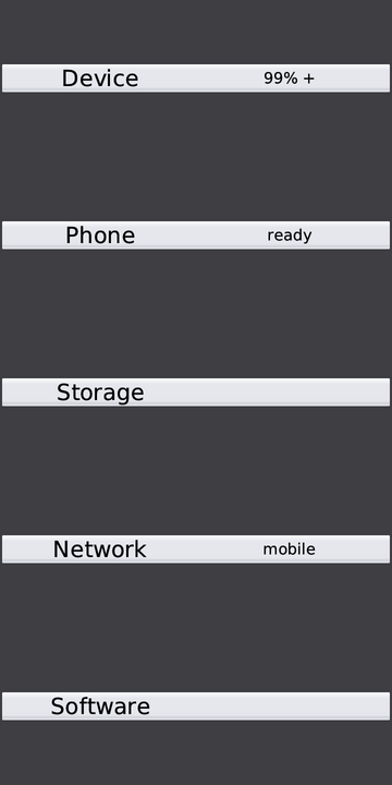
The home screen is vertically divided into the five sections "Device", "Phone", "Storage", "Network", and "Software". Each section covers an orthogonal aspect of the device. To the right of each section title, the most important status information is immediately visible.
The section titles stay visible at all times. The user can decide to go into detail of one aspect by touching the section. This prompts the section to unfold, revealing further details and options. When one section is selected, the other section titles stay at their logical position but go out of the way by becoming smaller and by blending into the background. Any section can still be touched to unfold it.
This concept is in stark contrast to the predominant use of cascaded menus in commodity devices. Cascaded menus replace one screen with another whenever entering a sub menu. Menus often contain a long scrollable series of options. To stay oriented, the user has to memorize the path into the sub menu and the mental model of the scroll position. In contrast, by keeping the five main sections on screen all the time in a spacial consistent manner, the user can never become disoriented but can visually see (and remember) the logical path to each option. It goes without saying that this concept won't scale to an all-encompassing user interface accommodating all functionality of the device. But since our scope is restricted to the appliance-like subset, it fits.
Device section
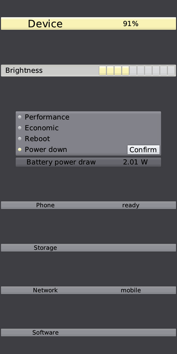
When unfolded, the device section gives access to physical controls of the phone. As pictured, the status information reveals the battery charging level and charging state. A little + sign (as seen in home-screen image) indicates that charging is in progress. More details are presented inside the device section. E.g., when the device runs on battery, the power draw is displayed as a diagnostic aid. The physical effect of adjusting the display brightness can be directly observed in terms of power draw.
The user has a choice of different operational levels of the device ranging from high performance, battery conserving operation, over reboot, to powering down the device. We foresee a sleep mode (with the display disabled) and our aspired deep standby mode to become part of these options.
The device section would also be the designated place for displaying and adjusting the current time, and similar low-level functions.
Phone section
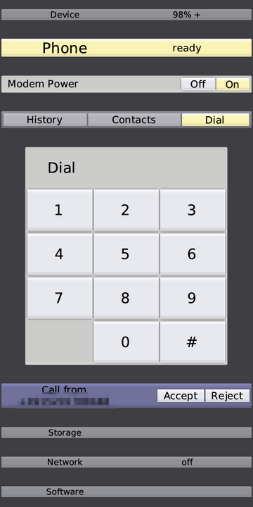
The phone section corresponds to feature-phone functionality, which entails voice calls and messages. In contrast to commodity devices, the user is in the position of direct control over the powering of the modem. The effect of the modem power switch is comparable to a hardware kill switch, which gives the user ultimate control.
The phone section allows for the interacting with the SIM card (entering the PIN), issuing voice calls with the pictured dial pad, and taking (or rejecting) voice calls. While a voice call is active, the user can toggle the speaker and has the option to hang up. Down the road, we plan to gradually extend the functionality towards the issuing of calls from a list of contacts, keeping records of the call history, and handling simple SMS messages.
Storage section
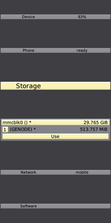
The storage section gives the user control over persistent storage devices. In the current (intermediate) state, the dialog offers block-device access, like selecting a partition of an SD card as location for storing application software. In the future, we envision the addition of file-browsing and file-management functionality so that the information persistently stored on the device becomes fully transparent to the user.
Furthermore, the storage section will be the natural place to create and unlock cryptographic storage containers, offering the user an easy way to protect personal information like the address book, browser bookmarks, or credentials.
Network section
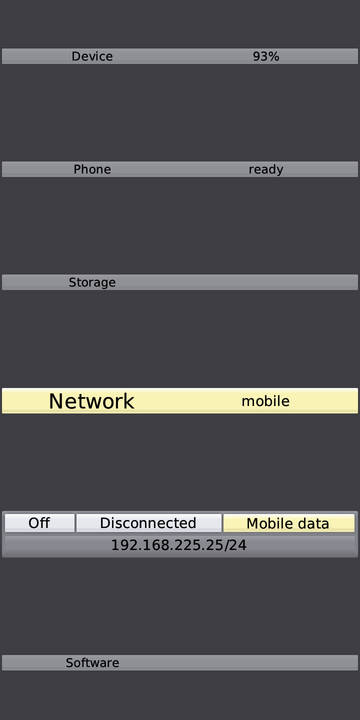
The network section presents the connectivity options. In the picture, a mobile-data connection via the modem is active as indicated by the status information. In the future, the section will offer the choice to connect to a Wifi network. It will also be the natural place for hosting the option to access a virtual private network using WireGuard.
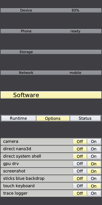
Software section
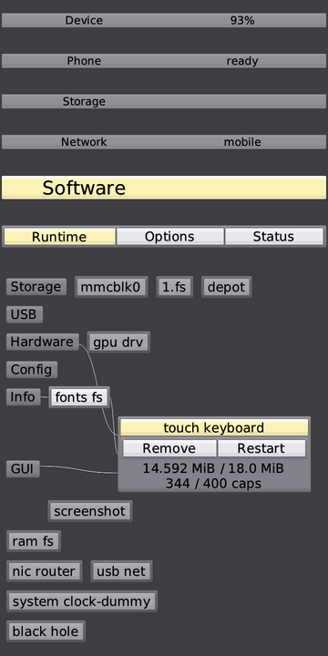
With both persistent storage and network connectivity enabled, the user can start shaping the right side of the system by installing and deploying software packages. Similar to the Genode-based Sculpt OS for the PC, the runtime environment can host an arbitrary selection of components originating from potentially different software sources. The current composition of components is shown in the form of an interactive graph. When selecting a component, the graph reveals the relationship to other components and offers options to monitor and control the component. Again, this fosters the user's sense of transparency, dependability, and control.
The component graph is accompanied with a number of selectable components as software options as depicted below. It allows the user to quickly add or remove a set of pre-configured components.
Over time, the software section will be expanded with the ability to browse package menus offered by different software sources, to interactively install packages, and to define the deployment rules for such added components.
Current state and immediate plans
The concept outlined above is already implemented for the PinePhone. Instructions for building the system image can be found as part of the Genode release documentation. Later this month, we plan to offer a first ready-to-install image for the first round of tests. For those eager to participate, please consider joining or monitoring Genode's mailing list for the announcement.